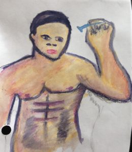
Despite the fact that computer paper isn’t the best for watercolor paintings, all practice is good practice at this stage in the project.
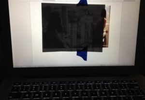
Here’s my workaround to not knowing how to draw. I used painter’s tape to place my paper onto the laptop screen. Then I brightened the screen, turned off all other lights, then traced the image with a soft lead pencil. Instead of relying on random Google images, I used the images specific to the project.
My dearest hope is that as I progress with these paintings, I’ll be able to depict the human body far more attractively than what I’m doing now, especially with better quality paper where I’m not chasing the water around the paper to get the pigment in the watercolor pencil to dissolve.
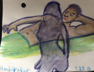
“Ambivalent” is a particularly challenging illustration since the woman is a shadow and to really portrait it the way I envision, the whole painting should be bathed in a shadow wash with lit places to imply that she’s emerged from a bathroom, but I took two challenges at a time by juxtaposing the two images and making hers see-through.
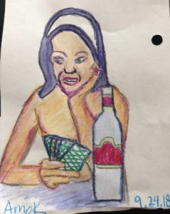
I also focused on composition for “Amok” as well. My struggle continues to be the lack of subtlety, which is another quality I’d like to capture. In the spirit of Thomas Edison’s 99 fails to get to the proper way a lightbulb works, I discovered that this wasn’t the proper combination of blue and orange to achieve dark brown.
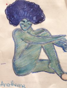
As a matter of fact, “Anathema” was my inspiration to buy at least on shade of brown, along with some other colors not in my 84 mega set the next time I visit the art store. I love blending as much as the next budding artist, but I need to hedge my bet a bit more than this.
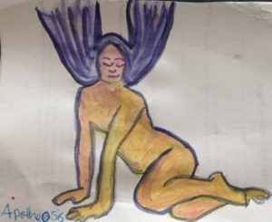
“Apotheosis” is a fine example of where I’d like to become better with subtlety with hair. I want to see more volume with the strands of hair. As far as the rest, I trust I’m going to improve with the nudes as I practice.
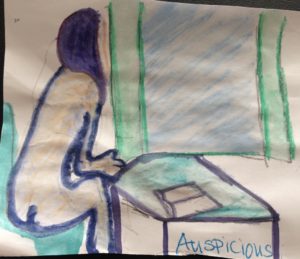
“Auspicious” was supposed to have a nude guy standing on the other side of the window, facing away from her, but I concentrated so much on using the two images for the cafe and the woman. Next go around, even though I liked what I did with the window, I’ll have a nude guy standing on the other side of it.

