A Better Bull’s Eye

Hard to believe that I’ve been working on my World’s Sexiest Dictionary for several years now. So long in fact, that a pandemic has come and gone and yet, I’m still working on this project, which was a radical idea at the time and even now, still motivates me to pour energy into on a daily basis.

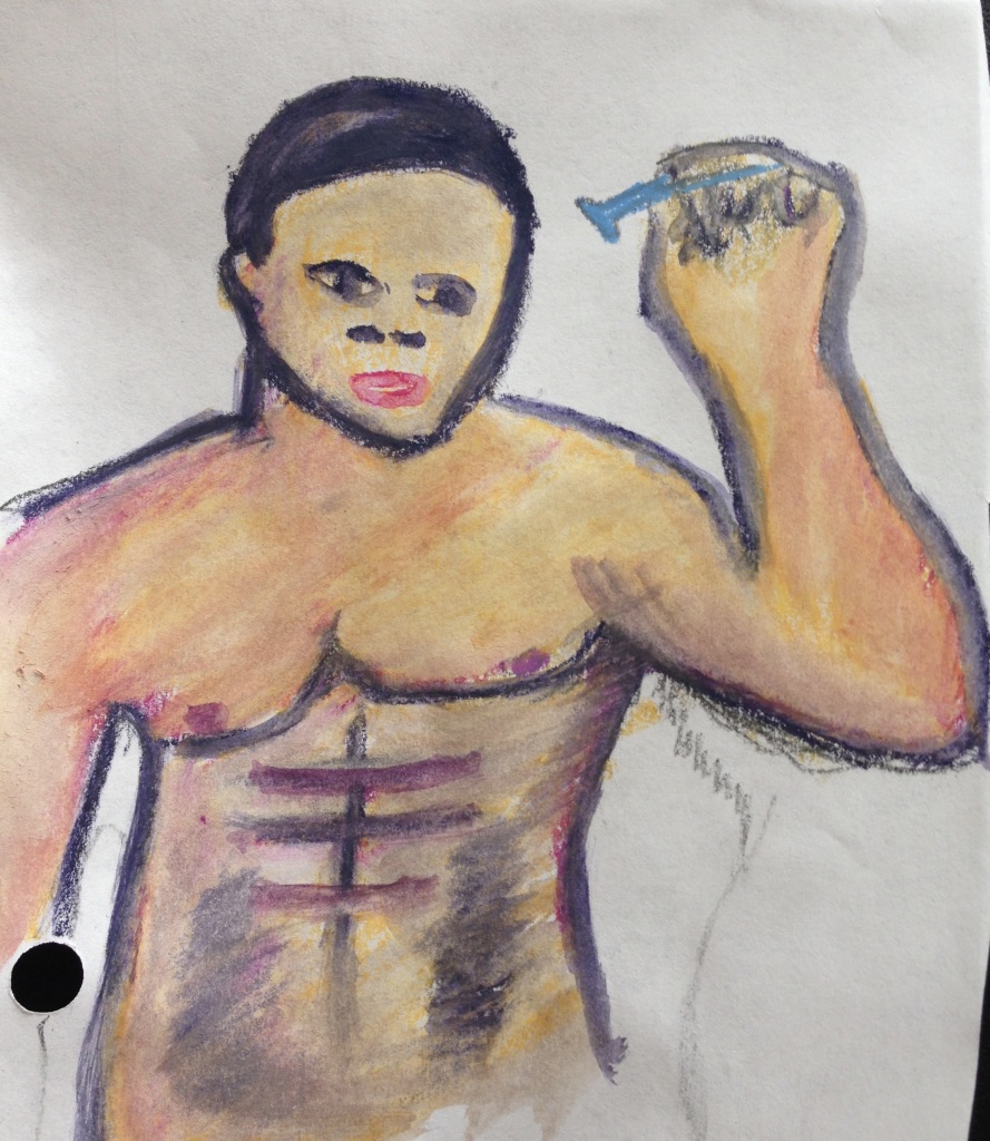
Computer Paper & Watercolor Crayons

My humble beginnings started off with regular computer paper and watercolor crayons. My logic was since the crayons was a new medium, I’d start practicing with the cheapest paper possible. If I could make that look decent, then I’d spend money on the better materials.

When I was at a social event, I told an art teacher about the illustration project I was working on. Without knowing what assbackwards method I had been using, she asked if I using a digital illustration app. Of course not, but I took her advice.

Rough Draft Digital

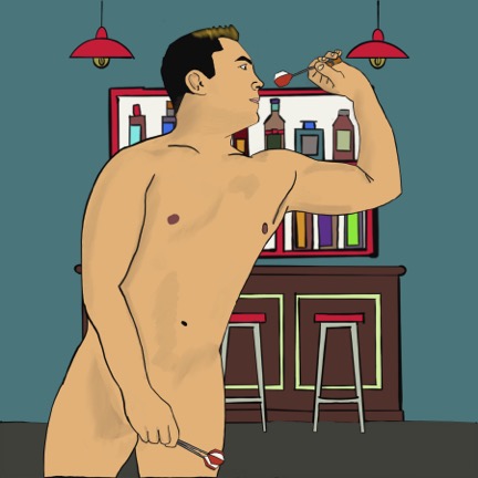
A month before the 2020 COVID pandemic shutdown, I bought a tablet and the digital app and started my journey to learn another new medium. Not only was it an easier process, but it was portable and involved no clean up.

One of the many lessons that I learned in having to complete 156 illustrations was that my inner critic had to be OK with leaving an illustration looking “good enough,” whatever that meant at the time. I had faith that my technique would improve over time. All I had to do was keep moving forward.
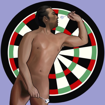
Final Draft Digital

I’ve called this third rendition of the 156 illustrations the “FINAL” set. I’m not going to stop digital illustrating, but I’ve finally hit a level with this project where I could complete them, publish them, and then move on.

Time will tell how many more years that’ll take.

Watercoloring Breakthrough

May not look like much to others, but with this painting, I stumbled onto subtle blending–except for his hands. There’s usually an area or two where I just concede that the effort has defeated me. For this painting, it’s definitely the hands. The hands are so bad, one may not even notice the lips aren’t that great either.

But I love the blending everywhere else. Up until this point, I thought that I had to first color the shading and contouring, then merely paint to blend those colors with water. What I realized through trial and a lot of error, was, unlike painting with oils, watercolors must be layered to produce the desired effect. The blending technique I use with oils just muddy watercolors.

I’m sure I could have watched even more YouTube videos about painting with watercolor crayons, but it’s been a wonderful journey to put all this together. I even recently bought a refurbished monitor that didn’t come with a stand, so I could lay it flat in my lap while it’s hooked up to the laptop, projecting the image that I’m tracing onto tracing paper. Genius!

I finally found a workaround to my lack of drawing skill. Now, I’m practicing to become more respectful of the medium. I’m not looking for mastery, which means with every improvement, I’m going to be ever so happy. No matter how small the gain.

I have 16 pages of drawing paper before I switch to actual watercolor paper. From there, the remaining rough drafts will be completed on watercolor paper. By then, I expect to up my game even more since a better quality of paper will look better.

Sexiest Dictionary: New Colors

After nearly two months upon discovering that my set of 84 watercolor crayons didn’t match the picture on the front, I returned to the art store to purchase several browns, nearly black, nearly white and two shades of red. The same woman who’d helped me before, helped me again. She remembered me.  When she asked about how far off the picture on the box was from what was in the box, I replied, “If I only wanted to paint White people, then it would have been fine.” She nodded and said, “I know exactly what you mean.”

Once she finished checking me out at at the register, she then showed me where the watercolor paper was as well as the tracing paper.  I told her that I wanted to get an idea of the prices, so I could budget for it. In the meantime, I’m going to have a ball with my new colors, not just to paint people of color, but also expand hair and eye colors without having to obsess about mixing shades. I’m especially eager to render a dark-skinned Black without them looking unrealistically blue.

I loved how the contouring turned out on her backside and back of her knees.  The water didn’t turn out how I planned–like most of my painting dreams.

Again, I have to be careful not to elongate features. For some inexplicable reason, she looks armless. There’s some detail that I missed in the tracing and even with the picture printed out, I overlooked her arms, which were subtly shown in the original.

I watched a YouTube video on painting with watercolor crayons that stated these paintings will dry and, almost by magic, look so much better. That was certainly true for her face. His face, on the other hand…not enough magic in the world to salvage his face.

For my next challenge, I’m going to have blonds and gingers!

Sexiest Dictionary: Latest Round

Although I like the blending and contouring in “Contentious,” this guy’s chest remains undefined because the model in the picture was wearing a shirt. I have to develop a technique for painting an attractive man’s chest.

I realized after the fact that his head was too small.  In the picture I used, the guy wore a hat, which I didn’t want, but I inadvertently made his head too small in the process.  Her face was challenging to paint because it was too small for details and I used too much water for the given space.  Once I buy the inexpensive watercolor paper, no faces will be this small.

Her face was almost too small, but I made sure to use a damp brush rather than a wet brush for her face. I’d also traced her hand too large, but I slimmed it down to a more realistic size while painting. Yet, I like her blending and I can do something better with the tub water next time.

I love that this guy actually looks Asian. Too bad I messed up his pecks and the contouring on his lower abs look more like bruises.

The combination of the smallness of the tracing and fact I tried to create another brother without having an actual brown watercolor crayon, propelled me to buy the missing colors. I’ve grown so tired of trying to blend the right combinations of blues and orange, or yellow and purples to make brown. It’s going to be a sheer relief to paint people of color in a more straight forward way.

Sexiest Dictionary: Contouring & Shading

This week’s painting challenge was to add contouring and shading, so I could possibly cure the facial paralysis my subjects had. I still used non-watercolor journal paper, which made blending rough and it wrinkled. Plus, I still hadn’t bought the watercolor crayon colors I needed: black, red, white, and brown.This was my first attempt at the new skill. I even hedged my bet by printing out the original picture. I was so happy with her expression and hairstyle. Having a visual aid worked so beautifully that I waited a few days to paint the others in order to print out the remaining pictures.

I should have known when I couldn’t attach the whole template file with the images to an email, that saving it to my google drive to print it out where I volunteered wouldn’t work either. I discovered that the hard way. With my printing lesson learned, I stopped being a halfass and divided up the word doc among 9 different email attachments to print in the business office at my apartment complex. In order to save both ink and paper, I printed out 2 pages per sheet. I managed to print out all the email attachments except for one cause there’s always at least one stopper, which in this case turned out to be low ink.

Nonetheless the effort was worth it. Even though this next painting didn’t contain a face, the contouring wouldn’t have looked this good without a visual aid.

Once again, I screwed up when trying to paint a black person. The blending of the crayons looked so good before I added water to it. What I finally learned, thanks to this painting, was that blue needed far more respect for its ability to darken. I’d meant it for shading and contouring, but it just overpowered everything.

Somehow, with all the tracing and visual guidance, I managed to take the sexy out of this nude woman texting on her bed. The foreshortening failed as well as her elongated face. Yet the disaster known as her fingers distracted me more than anything else. Second time around, I’m definitely going to pay more attention to tracing and shading them.

Had I been paying attention, I would of traced the guy first. Her attitude was a little off because instead of focusing the features that would have captured her scowl, I was preoccupied with making her look like a black woman and fixing her nose. I pretty much surrendered and not in the spiritual growth way. His contouring was decent except the trace of her hair appears in his right shoulder.

Now, I got this black man right! Imagine how good he’s going to look when I have actual brown and black watercolor crayons. The dreadlocks need work, but otherwise, I loved how this guy turned out.

This was a terrific way to end the week.

Sexiest Dictionary Paintings: A New Approach

In the latest round of practicing my illustrating technique for the sexiest dictionary, I disassembled my home office. Totally worth the sacrifice.  I had no desire to sit at my work desk on the weekend. Instead, I relocated my work computer and monitor to the living room, so I could paint while the TV entertained me.

Since the monitor couldn’t reach the outlet, I used an extension cord. I doubled the cord and wrapped it up from the middle in order to have the two ends free.  To keep everything in place, I wrapped the bundle with one of the many pieces of cloth that live on the shelf in my closet.

Using a larger and different type of paper, I taped it to the monitor with all the other lights out, and quickly traced the outline. In order to be more efficient, I’m only going to disassemble my work station on the weekends since I’m not going to reassemble it until Sunday night.

As I predicted, better paper improves blending. The paper still wrinkled a little. And as I blended, the paper wore away.At least I didn’t make any holes.

Yet the most glaring critiques are the lack of contour shading and their facial expressions.  Their mouths are either too big or too small as if I don’t want them to speak the truth about their paralyzed faces or other inadequacies of my painting ability in this medium.

I’m going to be more mindful of those things moving forward. Also, as much as I’d like to save paper, I’m going to need to print out the images.  I don’t need them to be full size, but I need to look at the contouring and subtlety of their expressions. I don’t want to fool with signing into my laptop just to see the image.

Part of the excitement of doing projects like this is figuring out the cheapest and most efficient approach.  Since I volunteer at a film school/coworking space, one of the perks is that I have use of their color printer to help move my creative projects forward. I’m so grateful that I can barter my time for both film classes and administrative services.