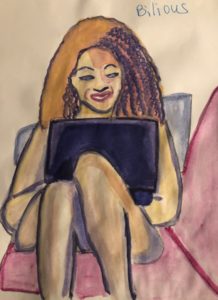
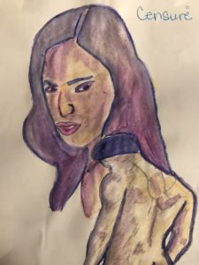
This week’s painting challenge was to add contouring and shading, so I could possibly cure the facial paralysis my subjects had. I still used non-watercolor journal paper, which made blending rough and it wrinkled. Plus, I still hadn’t bought the watercolor crayon colors I needed: black, red, white, and brown.This was my first attempt at the new skill. I even hedged my bet by printing out the original picture. I was so happy with her expression and hairstyle. Having a visual aid worked so beautifully that I waited a few days to paint the others in order to print out the remaining pictures.
I should have known when I couldn’t attach the whole template file with the images to an email, that saving it to my google drive to print it out where I volunteered wouldn’t work either. I discovered that the hard way. With my printing lesson learned, I stopped being a halfass and divided up the word doc among 9 different email attachments to print in the business office at my apartment complex. In order to save both ink and paper, I printed out 2 pages per sheet. I managed to print out all the email attachments except for one cause there’s always at least one stopper, which in this case turned out to be low ink.
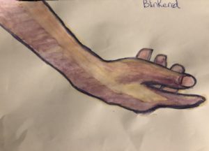
Nonetheless the effort was worth it. Even though this next painting didn’t contain a face, the contouring wouldn’t have looked this good without a visual aid.
Once again, I screwed up when trying to paint a black person. The blending of the crayons looked so good before I added water to it. What I finally learned, thanks to this painting, was that blue needed far more respect for its ability to darken. I’d meant it for shading and contouring, but it just overpowered everything.
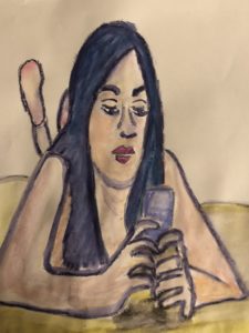
Somehow, with all the tracing and visual guidance, I managed to take the sexy out of this nude woman texting on her bed. The foreshortening failed as well as her elongated face. Yet the disaster known as her fingers distracted me more than anything else. Second time around, I’m definitely going to pay more attention to tracing and shading them.
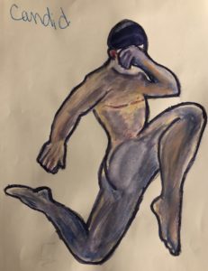
Had I been paying attention, I would of traced the guy first. Her attitude was a little off because instead of focusing the features that would have captured her scowl, I was preoccupied with making her look like a black woman and fixing her nose. I pretty much surrendered and not in the spiritual growth way. His contouring was decent except the trace of her hair appears in his right shoulder.
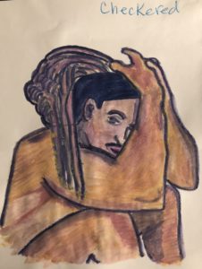
Now, I got this black man right! Imagine how good he’s going to look when I have actual brown and black watercolor crayons. The dreadlocks need work, but otherwise, I loved how this guy turned out.
This was a terrific way to end the week.


