Allow me the indulgence about how the universe works.
I asked a network of professional women for a recommendation. I sought a woman of color who was a illustrator or animator. I even included two examples of my illustrations from my current work, The World’s Sexiest Dictionary. No one made a suggestion. I wasn’t sure whether the lack of response was due to apathy or they didn’t know of any illustrators/animators who were women of color. Either way, the Universe answered via email about a workshop with a bonafide graphic artist/animator a day or two later.
Just to show how much of a unicorn she was,
Samara was the first Black woman to graduate with a graphic arts design degree at her school. This was in the 90s, but still so recent to be a first Black anything. Nonetheless, I loved attending her session, which was a combination of art therapy, artist interview and painting.
Although watercolor is my least favorite medium to paint with,
I appreciated the enthusiasm she brought to the medium. At least I had a chance to break out with my watercolor crayons. I hadn’t touched them since I completed my 156 rough draft illustrations for my dictionary.
The first thing that Samara advised any of us who were interested in becoming full-time artists was NOT to quit our day jobs. I laughed because that’s usually the first advice all entrepreneurs give everyone. There are so many pitfalls involved with being an entrepreneur that not everyone takes into account, being dazzled by the freedom of having control of one’s own schedule and the possibility of making far more money, doing what one loves. If not as successful, the steady income from a day job is sorely missed as the bills start to collect.
One of my objectives for attending the workshop was to get Samara’s contact information, so I could ask her the five questions I’d written out for a future mentor as a professional development exercise. Whether she ever answers those questions or not, at least I put them out there.
As a matter of fact, I set out with this life-changing mission with the attitude that I was going to collect 100 no’s or rejections within the year. I’ve not actually ticked off how many rejections/no’s I’ve gathered so far, but I don’t think I’ve even received 20 of them yet.
As we say in sales, every “no” brings one closer to a “yes.” It’s a good thing I’m getting into a sales state of mind since my current customer service day job has opened up a sales opportunity, which has the potential for making more money. That’s one of my goals, but not all of them.
In a sick way, scammers and con artists are pretty good psychologists. If only they’d use their skills for the forces of good….
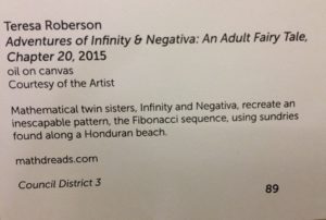
For my second novel, The Adventures of Infinity & Negativa, I painted 24 oil canvases to illustrate the story. Perhaps, in retrospect, it was a cumbersome way to illustrate a book, but I loved every minute of going out onto my balcony and painting them.
Years after my book came out, I listed the paintings on Etsy. A few weeks afterwards, the world shut down due to the coronavirus AKA COVID-19. Not a great time to sell art as everyone clutched their pearls and their wallets to hunker down for the unknown.
Nearly a year after being quarantined, Mother Nature conspired with ‘Rona. Five back-to-back snowstorms hit Texas, which overwhelmed the electrical grid. After two days of no electricity, I then had no running water; so, I took refuge at a friend’s house.
When I woke up on the first morning of my new refugee status, an email brightened my day.
Out of nowhere, a buyer was interested in the Chapter 10 painting. My spirits soared. Selling one painting would help make up for a week’s worth of pay I’d missed due to not being able to work.
The buyer messaged me via the Etsy platform, asking for my email address. Under normal circumstances, this should have been a red flag. Not that my personal email address was sensitive information, but logically, if a buyer messaged me through the Etsy, why the need for my personal email address? Nonetheless, I was too excited not to accommodate the request.
The second red flag came in the email. The interested buyer, whose first name was the same as mine (nice touch, scammers!), spun this story that her uncle wanted to buy my painting as a surprise gift for his wife, but didn’t want to go through the Etsy platform. Instead, he’d send a check, which the niece would send via certified mail. She verified the cost of the painting at least twice, which included shipping, and informed me where to mail the painting. She then requested my mailing address. Then, in what seemed to be an after thought, she also requested my phone number in another email just to clarify the price again, so she could text me when to expect the check.
Again, I wasn’t thinking straight. I found nothing wrong with sharing things I would’ve readily put on a business card. And yet, the entire transaction could have taken place via Etsy without all the back and forth.
In the meantime, I googled the West Virginian address that she’d given me. When Google couldn’t find the exact location, I asked her to double check the address and send me her phone number, so I’d know it when she’d text.
When I excitedly told a friend about my impending sale, he wrote me a reality check: in the 12 years he’d sold things online, he’d never been offered a check that wasn’t fraudulent.
The next day, I returned to my apartment. As I picked up my life from where I’d left off, I braced myself for the fact that I was being scammed.
A few days later, the other shoe dropped. The buyer informed me that, despite her confirmation of the price several times, her uncle’s financier had made the check out for more than the agreed upon price. So, she urged me to deposit the check, and mail the painting along with a refund of the difference.
Whoomp, there it was! I’d already known that it was bullshit, but hell, I’d been quarantined for nearly a year and needed some entertainment. I responded that as soon as I received the check, we’d move forward from there.
Days later, “she” texted me that I’d receive the certified envelope with the check that day. Again, “she” encouraged me to quickly deposit the check, send her the difference and mail the painting.
For shit and giggles, I checked my mailbox.
Sure enough, the envelope was there. I had no idea who “Thomas House” was. It could have been the uncle. Even so, the return address was in Pennsylvania yet the painting was to be mailed to some West Virginian place that Google couldn’t find, but there was more.
I laughed my ass off when I saw the check amount, but doesn’t the check itself look legit, sight on seen? I mean, despite the fact that “she” now spelled “Teresa” with an H and had a different surname.
The “bank” that issued the check was located in Montana.
I looked up the bank address. Again, Google couldn’t find an exact location, but I called the nearest branch to the printed address. I spoke with their customer service representative who verified that the listed routing number, which is unique for each bank, wasn’t theirs.
As I spoke with the customer service rep, she assured me that scammers were really good at making their checks look official, complete with hologram stickers and watermarks. She also said that when she bought things on Etsy, she paid through the platform without any backstory. At that point, I told her the name of my Etsy shop, TYRCreations, which she later checked out and liked.
(For the record, when I later googled the routing number, 103100551, the first thing that popped up was a counterfeit check scam from a Pennsylvanian bank, Hatboro Federal Savings, back in 2018.)
As I talked with the customer service rep through my hands-free headset, I drove to my bank.
I dreamed about the bank stamping the check with a big red “VOID” or “FRAUD” or some equally menacing thing.
I explained the situation to the teller. She also confirmed that the routing number didn’t match the listed bank. Then she pointed out that the two addresses on the check should match.
Even though my bank had no fun stamp because they usually throw fake checks away or shred them, I borrowed her red pen to write “VOID” on it myself. Then I took a picture of the check.
I texted the picture to the scammer buyer, stating that when I attempted to deposit it, the routing number didn’t match the bank, but if they were still interested in the painting, then make a payment through the Etsy platform.
I’m one of the few people who turns off her cell before going to bed. When I turned it on the next morning, the scammer had texted, “Hello, Teresa.” Really? So cool to the fact that the alleged uncle’s financier had sent me a hot check? I deleted the text without answering.
The next day, I got an email about whether I’d received the text. I deleted that too. I’m sure they wanted to maintain the ruse by telling me that they could get the money to me sooner if I’d give them my account information. I didn’t give them the opportunity.
Those scammers had probably watched the news, saw how the snowstorms rocked the vulnerable Texas electrical grid, cruised Etsy to find some Texas sellers, figuring that we’d be too stressed to think straight, and cast a net.
The morals of the story: never accept checks from strangers and use the Etsy payment platform since that’s what it’s there for.
May not look like much to others, but with this painting, I stumbled onto subtle blending–except for his hands. There’s usually an area or two where I just concede that the effort has defeated me. For this painting, it’s definitely the hands. The hands are so bad, one may not even notice the lips aren’t that great either.
But I love the blending everywhere else. Up until this point, I thought that I had to first color the shading and contouring, then merely paint to blend those colors with water. What I realized through trial and a lot of error, was, unlike painting with oils, watercolors must be layered to produce the desired effect. The blending technique I use with oils just muddy watercolors.
I’m sure I could have watched even more YouTube videos about painting with watercolor crayons, but it’s been a wonderful journey to put all this together. I even recently bought a refurbished monitor that didn’t come with a stand, so I could lay it flat in my lap while it’s hooked up to the laptop, projecting the image that I’m tracing onto tracing paper. Genius!
I finally found a workaround to my lack of drawing skill. Now, I’m practicing to become more respectful of the medium. I’m not looking for mastery, which means with every improvement, I’m going to be ever so happy. No matter how small the gain.
I have 16 pages of drawing paper before I switch to actual watercolor paper. From there, the remaining rough drafts will be completed on watercolor paper. By then, I expect to up my game even more since a better quality of paper will look better.
After nearly two months upon discovering that my set of 84 watercolor crayons didn’t match the picture on the front, I returned to the art store to purchase several browns, nearly black, nearly white and two shades of red. The same woman who’d helped me before, helped me again. She remembered me. When she asked about how far off the picture on the box was from what was in the box, I replied, “If I only wanted to paint White people, then it would have been fine.” She nodded and said, “I know exactly what you mean.”
Once she finished checking me out at at the register, she then showed me where the watercolor paper was as well as the tracing paper. I told her that I wanted to get an idea of the prices, so I could budget for it. In the meantime, I’m going to have a ball with my new colors, not just to paint people of color, but also expand hair and eye colors without having to obsess about mixing shades. I’m especially eager to render a dark-skinned Black without them looking unrealistically blue.
I loved how the contouring turned out on her backside and back of her knees. The water didn’t turn out how I planned–like most of my painting dreams.
Again, I have to be careful not to elongate features. For some inexplicable reason, she looks armless. There’s some detail that I missed in the tracing and even with the picture printed out, I overlooked her arms, which were subtly shown in the original.
I watched a YouTube video on painting with watercolor crayons that stated these paintings will dry and, almost by magic, look so much better. That was certainly true for her face. His face, on the other hand…not enough magic in the world to salvage his face.
For my next challenge, I’m going to have blonds and gingers!
Although I like the blending and contouring in “Contentious,” this guy’s chest remains undefined because the model in the picture was wearing a shirt. I have to develop a technique for painting an attractive man’s chest.
I realized after the fact that his head was too small. In the picture I used, the guy wore a hat, which I didn’t want, but I inadvertently made his head too small in the process. Her face was challenging to paint because it was too small for details and I used too much water for the given space. Once I buy the inexpensive watercolor paper, no faces will be this small.
Her face was almost too small, but I made sure to use a damp brush rather than a wet brush for her face. I’d also traced her hand too large, but I slimmed it down to a more realistic size while painting. Yet, I like her blending and I can do something better with the tub water next time.
I love that this guy actually looks Asian. Too bad I messed up his pecks and the contouring on his lower abs look more like bruises.
The combination of the smallness of the tracing and fact I tried to create another brother without having an actual brown watercolor crayon, propelled me to buy the missing colors. I’ve grown so tired of trying to blend the right combinations of blues and orange, or yellow and purples to make brown. It’s going to be a sheer relief to paint people of color in a more straight forward way.
This week’s painting challenge was to add contouring and shading, so I could possibly cure the facial paralysis my subjects had. I still used non-watercolor journal paper, which made blending rough and it wrinkled. Plus, I still hadn’t bought the watercolor crayon colors I needed: black, red, white, and brown.This was my first attempt at the new skill. I even hedged my bet by printing out the original picture. I was so happy with her expression and hairstyle. Having a visual aid worked so beautifully that I waited a few days to paint the others in order to print out the remaining pictures.
I should have known when I couldn’t attach the whole template file with the images to an email, that saving it to my google drive to print it out where I volunteered wouldn’t work either. I discovered that the hard way. With my printing lesson learned, I stopped being a halfass and divided up the word doc among 9 different email attachments to print in the business office at my apartment complex. In order to save both ink and paper, I printed out 2 pages per sheet. I managed to print out all the email attachments except for one cause there’s always at least one stopper, which in this case turned out to be low ink.
Nonetheless the effort was worth it. Even though this next painting didn’t contain a face, the contouring wouldn’t have looked this good without a visual aid.
Once again, I screwed up when trying to paint a black person. The blending of the crayons looked so good before I added water to it. What I finally learned, thanks to this painting, was that blue needed far more respect for its ability to darken. I’d meant it for shading and contouring, but it just overpowered everything.
Somehow, with all the tracing and visual guidance, I managed to take the sexy out of this nude woman texting on her bed. The foreshortening failed as well as her elongated face. Yet the disaster known as her fingers distracted me more than anything else. Second time around, I’m definitely going to pay more attention to tracing and shading them.
Had I been paying attention, I would of traced the guy first. Her attitude was a little off because instead of focusing the features that would have captured her scowl, I was preoccupied with making her look like a black woman and fixing her nose. I pretty much surrendered and not in the spiritual growth way. His contouring was decent except the trace of her hair appears in his right shoulder.
Now, I got this black man right! Imagine how good he’s going to look when I have actual brown and black watercolor crayons. The dreadlocks need work, but otherwise, I loved how this guy turned out.
In the latest round of practicing my illustrating technique for the sexiest dictionary, I disassembled my home office. Totally worth the sacrifice. I had no desire to sit at my work desk on the weekend. Instead, I relocated my work computer and monitor to the living room, so I could paint while the TV entertained me.
Since the monitor couldn’t reach the outlet, I used an extension cord. I doubled the cord and wrapped it up from the middle in order to have the two ends free. To keep everything in place, I wrapped the bundle with one of the many pieces of cloth that live on the shelf in my closet.
Using a larger and different type of paper, I taped it to the monitor with all the other lights out, and quickly traced the outline. In order to be more efficient, I’m only going to disassemble my work station on the weekends since I’m not going to reassemble it until Sunday night.
As I predicted, better paper improves blending. The paper still wrinkled a little. And as I blended, the paper wore away.At least I didn’t make any holes.
Yet the most glaring critiques are the lack of contour shading and their facial expressions. Their mouths are either too big or too small as if I don’t want them to speak the truth about their paralyzed faces or other inadequacies of my painting ability in this medium.
I’m going to be more mindful of those things moving forward. Also, as much as I’d like to save paper, I’m going to need to print out the images. I don’t need them to be full size, but I need to look at the contouring and subtlety of their expressions. I don’t want to fool with signing into my laptop just to see the image.
Part of the excitement of doing projects like this is figuring out the cheapest and most efficient approach. Since I volunteer at a film school/coworking space, one of the perks is that I have use of their color printer to help move my creative projects forward. I’m so grateful that I can barter my time for both film classes and administrative services.
Despite the fact that computer paper isn’t the best for watercolor paintings, all practice is good practice at this stage in the project.
Here’s my workaround to not knowing how to draw. I used painter’s tape to place my paper onto the laptop screen. Then I brightened the screen, turned off all other lights, then traced the image with a soft lead pencil. Instead of relying on random Google images, I used the images specific to the project.
My dearest hope is that as I progress with these paintings, I’ll be able to depict the human body far more attractively than what I’m doing now, especially with better quality paper where I’m not chasing the water around the paper to get the pigment in the watercolor pencil to dissolve.
“Ambivalent” is a particularly challenging illustration since the woman is a shadow and to really portrait it the way I envision, the whole painting should be bathed in a shadow wash with lit places to imply that she’s emerged from a bathroom, but I took two challenges at a time by juxtaposing the two images and making hers see-through.
I also focused on composition for “Amok” as well. My struggle continues to be the lack of subtlety, which is another quality I’d like to capture. In the spirit of Thomas Edison’s 99 fails to get to the proper way a lightbulb works, I discovered that this wasn’t the proper combination of blue and orange to achieve dark brown.
As a matter of fact, “Anathema” was my inspiration to buy at least on shade of brown, along with some other colors not in my 84 mega set the next time I visit the art store. I love blending as much as the next budding artist, but I need to hedge my bet a bit more than this.
“Apotheosis” is a fine example of where I’d like to become better with subtlety with hair. I want to see more volume with the strands of hair. As far as the rest, I trust I’m going to improve with the nudes as I practice.
“Auspicious” was supposed to have a nude guy standing on the other side of the window, facing away from her, but I concentrated so much on using the two images for the cafe and the woman. Next go around, even though I liked what I did with the window, I’ll have a nude guy standing on the other side of it.
After researching about which medium I wanted to use for my latest illustration project, I finally bought the biggest set of watercolor crayons the art store offered. Making the financial investment came in a roundabout way.
I’d bought a plane ticket to go back east to attend an event, which was a financial sacrifice, but I’d just sucked it up and planned on using my credit card reward points. Then, thanks to Hurricane Florence, I cancelled all those plans, got a 100% refund, and felt free to use a fraction of that expenditure to buy the watercolor crayons.
Just the week before, I’d bought a TV tray, which was such an inexpensive convenience, I’m amazed I waited so long. Sometimes, I get so caught up with being miserly with my money that I go overboard. Yet, I’ve used this tray for so many different things already. An in-home temporary artist studio is the latest endeavor.Since I’m still fundamentally miserly to my soul, I haven’t invested in watercolor paper yet. The results will be even better once I do, but in the meantime, I’m getting a feel for the medium.
Once I finally got everything set up to try out the crayons, the sun had already gone down and my indoor lighting was very yellow, distorting the true colors. So, when I reached for what I thought was brown, turned out to be purple, especially once I painted over it with water. I was less concerned about the computer paper wrinkling since I knew I’d not use it for my final product.For the second painting, I colored more with blending and contouring in mind, but I was still distracted by how “off” the skin coloring looked. Moreover, I went to a dark place where I felt that I’d wasted my money buying such a large set of crayons that didn’t have any browns. Lots of greens, blues, oranges, purples, yellows, pinks and no red.
As I looked dismally at the 84 collection of “useless” crayon colors, I noticed that the colors on the lid didn’t match the colors in the box, which I couldn’t have known since the box was completely wrapped in plastic when I bought it. I entertained thoughts of getting a refund when a more enlightened thought visited.
I grabbed my laptop and researched which two colors mixed together to make brown. I struck gold! Purple and yellow make brown. Blue and orange make brown. Red and green make brown, even though I have no red. I could hack a reddish color combining magenta with yellow. Or just buy a red watercolor crayon.
Nonetheless, with my creative energy returned, I traced out my third painting.This was purely an experiment to see the different types of browns I could get with one yellow crayon combined with five of the purple crayons. I quickly colored all the characters with the one yellow. Then went on top of it with a different shade of purple. Lastly, I painted over the coloring with some water. I wasn’t concerned about technique since I only had to prove to myself that I hadn’t wasted my money.
I was too tired to try out the purples with other yellows, but at least I’ve worked around that session’s mental block right out of the gates. I’ve got far more possibilities than I originally thought. The best part is that I have so many combinations to play with that all I need to do is carve out enough time during the weekend in to do so.
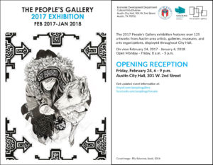
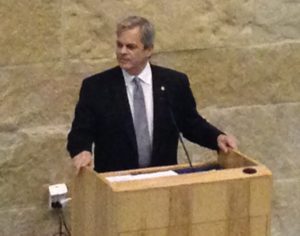
Being a part of the 2017 Austin People’s Gallery became real to me when I drove up to city hall and saw the line out of the building. I arrived 30 minutes late, or “on time,” according to some cultures, but I found two yoga friends already in line. The security check had created the line. A guard came out, passing plastic bowls, so guys could empty their pockets. He informed us women we could keep our jewelry on. One of my friends confessed to having a pocket knife. When the guard asked how big it was, she whipped it out to show him and he told her it was OK. I just laughed and asked the people behind us, who’d witnessed the exchange, if they felt safe.
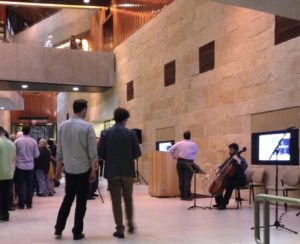
As befitting “The Live Music Capital of the World,” a musician performed near the entrance.
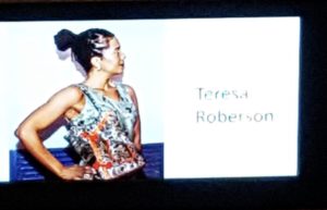
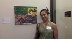
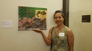
Two large screens flanked either side of the “stage area.” Once my picture flashed, I realized I’d worn the exact outfit as in my picture, making it appear that I only had one nice dress for an evening.
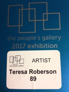
I received my name tag, which included the number of my painting and the booklet that included a layout of all the artwork along with an artist index.
The mayor told us a funny story about the architect who’d designed city hall and had liked the stone walls so much, he didn’t want anything to hang on them. So much for that!
We slowly ascended to the second floor, appreciating all the other work along the way while heading to my painting.
The design of the office space isolated my painting away from the other work. The people who placed my painting there did me a solid. So much good work was displayed that my painting could have easily looked shabby adjacent to a real painter’s work.
One of my friends teased me about having the title of my book in the painting’s title, but the real question is, why would I waste such an opportunity by not advertising my book? As a matter of fact, I think I could have been clearer that this painting illustrated a book. Probably better not to have gone overboard with the self-promotion.
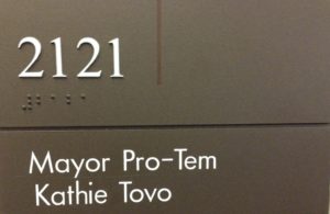
I hope Mayor Pro-Tem Tovo gets lots of visitors to her office. After the reception, I called my father, an avid lottery player, to give him a pick-3 and a pick-4: 089 and 2121.
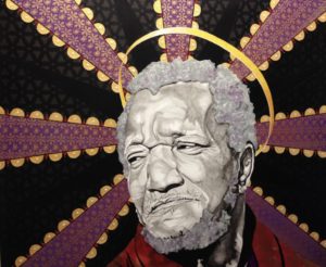
As soon as I saw Redd Foxx, I started singing the “Sanford and Son” theme song. The blurb stated this was how he’d look when he finally joined Elizabeth.
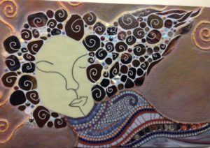
This mosaic exuded richness and complexity in its design, but such simplicity in the suggestion of her face.
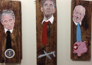
I didn’t bother to read the artist’s blurb for this work. I just figured these politicians should be paddled for the transgressions shown below their image.
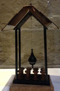
Since my long-term 2017 project is repurposing a dictionary for one of my nephews, I loved how this book had been incorporated into this contraption.
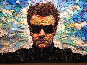
Among my friends and I, most of us saw the big picture of the guy, whereas one friend had zoomed into the tiny toys that created this mosaic. The 3-D pieces added more shadow and depth than my camera phone captured.
After attending this reception, I truly wanted to start another painting although I didn’t have the schedule to take on any new projects. Once the weather turns consistently warmer and the daylight lasts longer, I’ll have more incentive to put paint to canvas.